
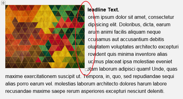
Recently, we were asked to left align the image to the top left of a paragraph. Pretty much what the post cover looks like. Everything looks so good but the Outlook. Because of it's notorious Word Rendering Engine, we can't just easily apply
align="left"to a table or an image. But ultimately, with the effort of Michelle and I(Eric), we figured out a way to make it happen.
At first, the code structure looks like this (only kept some key attributes):
<table>
  <tr>
    <td align="left">
      <table style="mso-table-lspace:0px; mso-table-rspace:0px;">
        <tr>
          <td align="left" valign="top">
            <!-- Image Table: Begin -->
            <table align="left" style="mso-table-lspace:0px;mso-table-rspace:0px;">
              <tr>
                <td><img src="" /></td>
              </tr>
            </table>
            <!-- Image Table: End -->
            <span><strong>Headline</strong></span>
            <br />
            <span>text</span>
          </td>
        </tr>
      </table>
    </td>
  </tr>
</table>
mso-table-lspace:0px; mso-table-rspace:0px; was added in each <table> tags to fix the extra spaces around the table in Outlook.
But Outlook is still acting weird, some content was covered by the something unkown in Outlook 2013 only.
We tried adding padding or margin and neither works, but we happened to figure out that mso-table-left: 0px; can fix this strange issue. In this way, table tags will look like <table style="mso-table-left:0px;mso-table-lspace:0px; mso-table-rspace:0px;">.
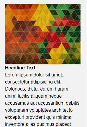
But then we faced another challenge that we need to perfect the mobile look so that Headline stays above the image while the rest stays beneath the image. So this what we have so far for the mobile look.
If we simply put the image table between headline <span> and the rest <span>, the Outlook won't act what you expected...
To achive the goal, we should utilize display: table-xxx-group;. As we talked in the previous post, whatever applied with display: table-header-group; will stay on the top of ther others, while display: table-footer-group; will push stuff to the bottom. But this time we will use display: table-row-group; to make sure whatever applied with this style can stay between the table-header-group and the table-footer-group. Put them into your media query and add proper class to your content. It will pretty much looks like this.
<table>
  <tr>
    <td align="left">
      <table style="mso-table-lspace:0px; mso-table-rspace:0px;">
        <tr>
          <td align="left" valign="top">
            <!-- Image Table: Begin -->
            <table class="table-row-group" align="left" style="mso-table-lspace:0px;mso-table-rspace:0px;">
              <tr>
                <td><img src="" /></td>
              </tr>
            </table>
            <!-- Image Table: End -->
            <span class="table-header-group"><strong>Headline</strong></span>
            <br />
            <span class="table-footer-group">text</span>
          </td>
        </tr>
      </table>
    </td>
  </tr>
</table>
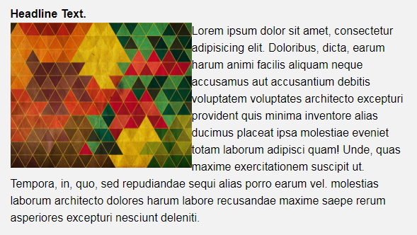
And here's what we got. YAY
As previous post introduced, by using
table-xxx-groupstyle will remove the padding you wanted. To solve that, you might need another<span>tag with padding styles to wrap your content. Put it between the tag hastable-xxx-groupand your content.
Alright, that's pretty much what we have for now. If you run into any questions or have any concerns or improvements. Don't hesitate to leave comment below. There's another thing I think you should know. It's just I noticed that if we set "text wrapping" property directly in Microsoft Word setting panel, it looks really good. But when it comes to the code, it's just not that flawless.