Ultimate Guide to Outlook Page Break Gaps


This is a guide that can help you understand the weird gaps ONLY in Outlook 2007 & 2010.
Before we start, I strongly suggest you analyze your recipient list, see if it's really worth to fix those gaps. Because you are about to cut some images into two parts and adjust your spacings. It's time consuming. And you should always apply the fix once your content is finalized. Any copy or image height adjustment will re-create the gaps and you'll have to re-apply the fix again.
In our company, we've been dealing with the gaps for years and different email designs. We'll have to deal with it case by case and EOA guide below doesn't always work out but I'll still highly recommend you to read it if you haven't. It's inspiring. And then you should understand what page breaks is in Outlook before you move on.
So... I come up with this idea of figuring out the behavior of Outlook 2007 and 2010 when encountering a page break.
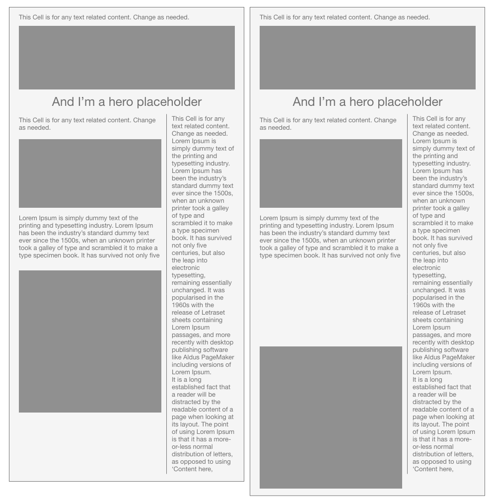
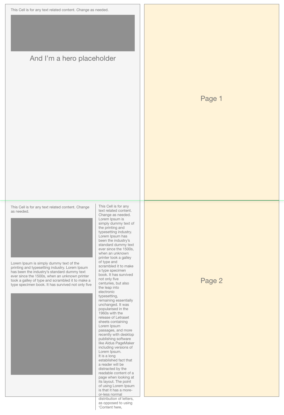
OK. Let's start. Now, suppose we have below email design (left one) and we could probably get the bad render (right one).
And if we pull out the design and compare it with page height in Outlook.
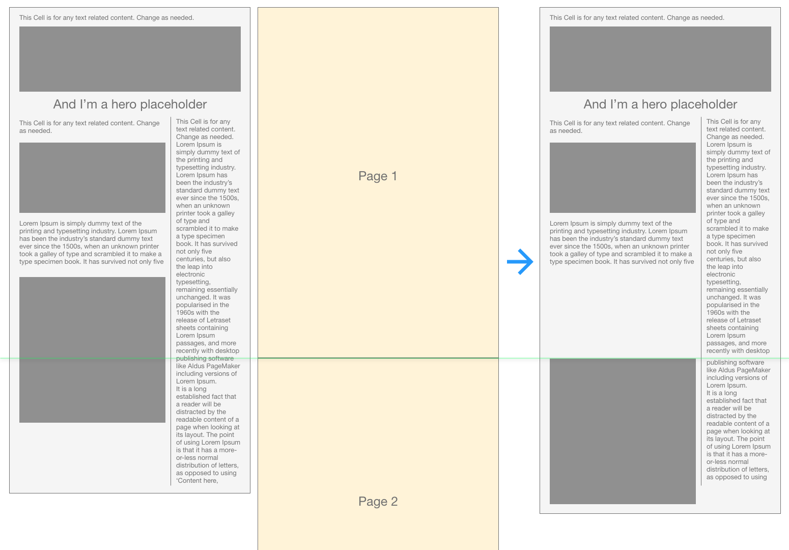
As you can see that the bottom edge of the first page crosses the last image which means that image can't fit into the remaining space of the first page. So, Outlook will move your image down to the next page. But text on the right can still fill in the remaining space. And thus gap created.
So far there's no way to prevent this happening, because that's how Outlook was programmed. The only thing we can do is with images or height stuff.
Then I come up with 2 ways to solve it. And you can choose whatever fits to your current situation.
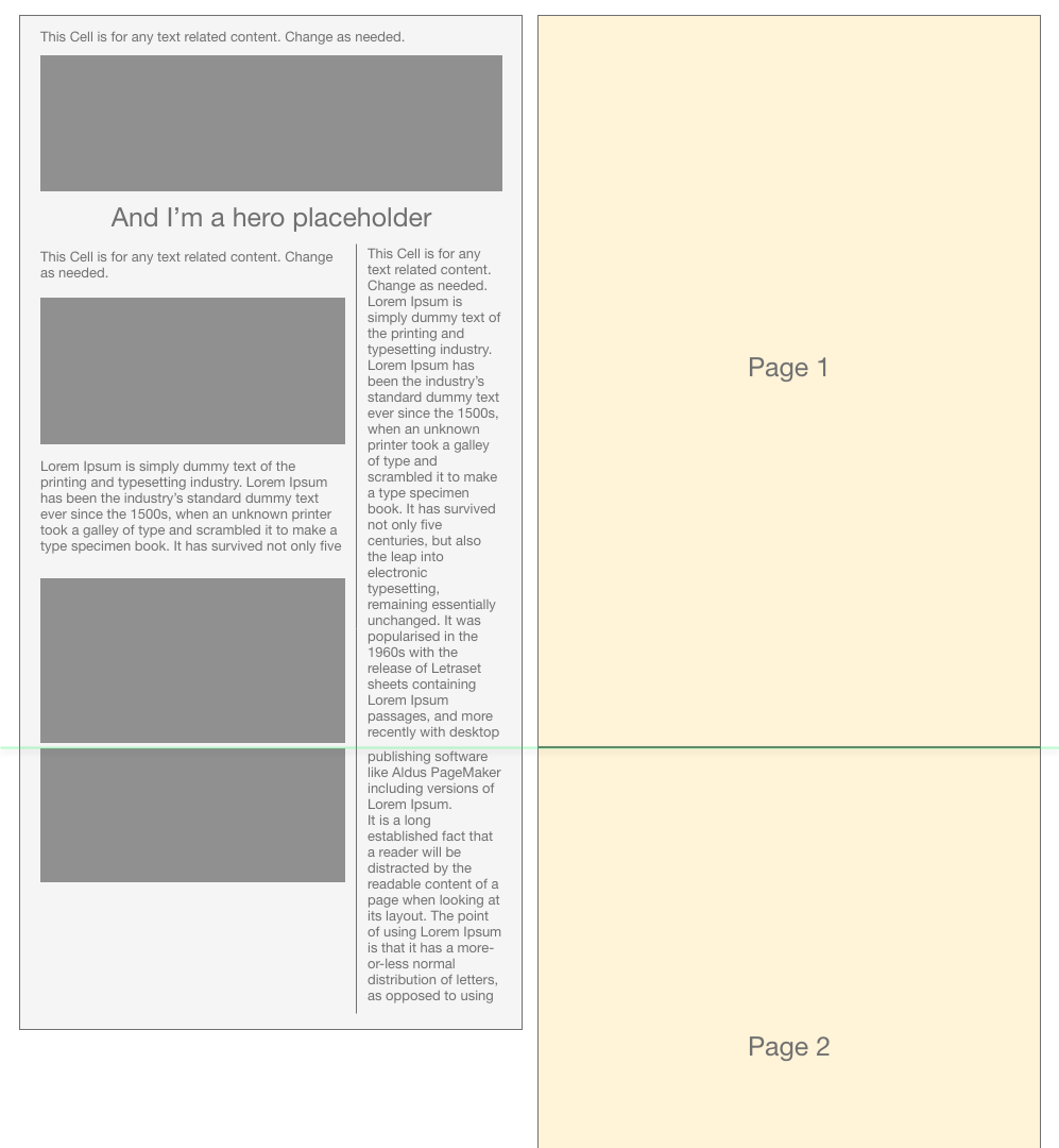
1 - Slice image into two parts precisely at the position that the page edge will cross on.
If you are careful enough, you probably will notice that there's bigger space between text lines.
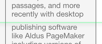
Don't worry, Outlook will adjust the space between lines (aka. line height) to be even. Because there isn't enough space left for another line, so you will always have a space there between 0 to actual line height.
2 - Set a fixed height for a cell to force it dropping to next page.
Mind that the height should be higher than the remaining space of previous page.
So with a decent height added to the body section(wrapper cell), it fell into Page 2. And then Outlook will cut off the big gap between the hero section and the body section. That way you don't need to re-slice your image. ;-)
But also note that you should always set the height to be less than the page height - around 1720px.
And if you don't do so, you probably will run into another issue like below.
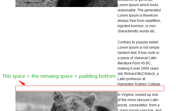
It's all because Outlook will try to leave enough space if content is shorter than the height set by you within a page.
And in this special issue, extra padding bottom was added too. Because, the cell, that's being cut off into two pages, has a padding bottom. So the padding bottom is duplicated into both separated cells in each separate pages. Just because you set the height larger than the page height.
Somebody may wonder, what if I set the height of cell to be 5000px which is much much larger than the height of 2 pages. Will above issue still happen to all the pages?
Well, after several tests, the answer is NO. The issue will only remain in the first/starting page of that cell you set with a height. And the rest pages will acting exactly the same as the way it displayed in the first screenshot.
Please let me know if it's not clear enough, I feel like it's miserable. But don't know if there's a better way to explain the way Outlook works.
I've put my testing code on the gist so you can grab, test and have fun.
Tricks
- You can set a height for a text cell. So that Outlook will treat it as like an image. If remaining space is not enough for the height, it drops to next page.
- We should always set the height smaller than the page height and the content height.
e.g. - If you have a text cell which actual height is 149px. But remaining space of that page is 100px. You should set the cell as 110px to drop it instead of 149px or any number heigher. - With knowing the 2 fixes above, when your email is much much longer than 2 pages or 3 pages long, you should consider utilizing both way in each page. To better cope the situation you run into in each page.
e.g. - You can literally set 1700px to a wrapper cell in Page 2. And then slice your image into two parts in Page 3 if that's more convenient.
Special case study
Think about below situation. What if you have a design like below regardless of that green line.
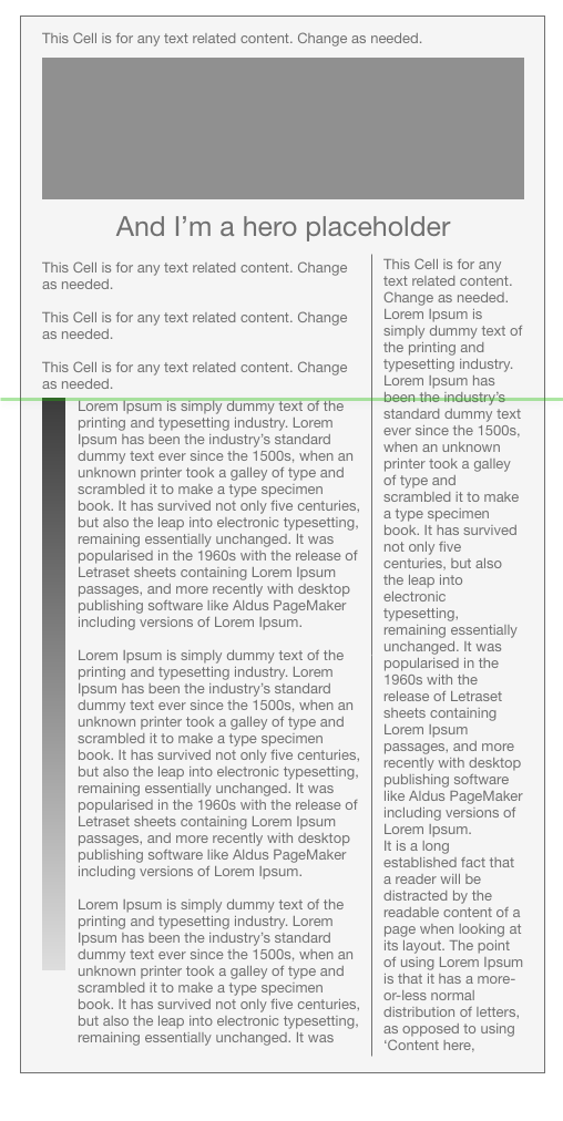
Not you have a very long horizontal stripe beside your text. And you have to slice it as a long image because the text wrapping may vary a little from client to client.
So apprently, we will need that green line as a starting point. Since the stripe table can't be sliced, we will have to use the second way to work it out. We should treat the left body text as a whole part and we can literally do anything about it. But we can do something with the sidebar. Maybe we can group all the text underneath the green line into a table cell and then give it a height to force it fall into another page.
That's true, but note that green line crosses the sidebar text. And if you will get a gap above the text group. So basically, you'll have to adjust the line height of the sidebar a little so that the green line won't cross the text. Or you can adjust the line height of the text above the stripe table. Either way would work. The goal is to make sure that the green line we visualized won't cross/cut off any text. So that no extra small gap will be created around the green line.
If you love this post, share with your friends who would be interested or through network Twitter, Facebook, Linkedin and anywhere. :-)
Also you can subscribe below. Thanks.