Using magic inline-block to align stacked dynamic height columns in mobile view


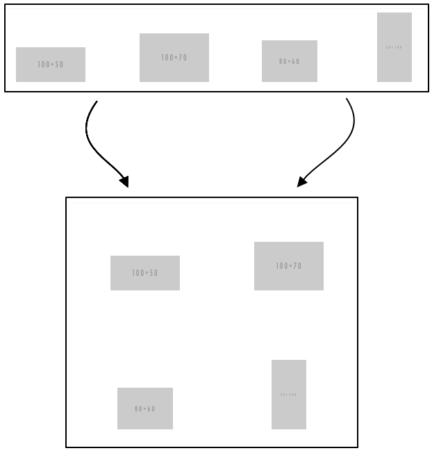
I run into a weird requirement last week that I have to bottom align 4 cells in 1 row in desktop design and 2 cells in 2 rows in mobile design. It's all because that each cell is having content with a dynamic generated unknown height by ESP.
It pretty much looks like this.
I was thinking of applying float: left;on each <td>s which we used a lot. But failed with below result as you could imagine.

Next I thought of maybe I can wrap two cells in one table. And then wrap the two tables in two cells. Then do the float to drop one cell down.
Pretty much like this:
<table>
  <tr>
    <td class="drop">
      <table>
        <tr>
          <td valign="bottom"><img src="" alt="" /></td>
          <td valign="bottom"><img src="" alt="" /></td>
        </tr>
      </table>
    </td>
    <td class="drop">
      <table>
        <tr>
          <td valign="bottom"><img src="" alt="" /></td>
          <td valign="bottom"><img src="" alt="" /></td>
        </tr>
      </table>
    </td>
  </tr>
</table>
BUT, it won't be super easy for developer to change the layout if the client request to have more cells or if the content is very complex.
So, ultimately I switched to use inline-block so that every inline element will align to the baseline. (If you are interested in the alignment of the inline element, you can check out my previous post.)
Code will look like this:
<table>
  <tr>
    <td class="inline-block half-width"></td>
    <td class="inline-block half-width"></td>
    <td class="inline-block half-width"></td>
    <td class="inline-block half-width"></td>
  </tr>
</table>
But we still have a little problem when we are previewing it in Firefox mobile view. (Well some clients are extremely picky) It feels like each cell is exceeding the width we set, so the sibling cell is pushed to next line.
This is caused by the markup being broken over multiple lines; when items are displayed as inline-block any carriage returns or tabs in the markup are recognized as a white space character. That being the case, you can fix this problem by writing your markup with no space between the items. — BROKEN LINKS (check out the original post)
So since every time when we code live text in email, we will set font-size, etc to the <td>. So the best approach is to add font-size: 0; to the wrapper <table>. And ALL FIXED! Check the example code below.
See the Pen Bottom Align Demo by Woody (@yxchai) on CodePen.
Yay, we did it. But people may have question why don't we use flex or grid? Well, that probably will be our next topic to discuss. But I believe it will be a long journey. So stay tuned.
I've there's anything wrong or I missed. Leave a comment or find me on Twitter.