Stack multi column list in responsive email

Recently I've run into a situation that need to stack a two column list. But actually the list is not a simple li element. In email, it's a table with a column of bullet and a column of content.
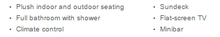
And I need it to look like below in mobile view.
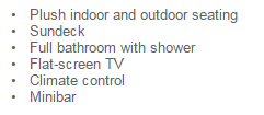
So in Dreamweaver it looks like below. And I bet it should be the most common way to code a list in email.
Usually we use float: left; to stack element. Now bullet is in it's own td. So if we add float: left; to all td element. It will make the bullet occupy one line.
I was thinking to wrap each set of bullet & content into one table and then insert each set of bullet & content into a 2*3 table. And it's really too redundant to me. Then I figured out a proper way to do this.
Because display: block; style will always occupy a whole line. So I was thinking to insert an empty each set of bullet & content and make all sets of bullet & content to be display: inline-block;. Thus it has it's original padding & margin, and it's displaying as inline element.
So the concept will looks like below.
display: inline-block; - left set of bullet and content
display: block; - blank row
display: inline-block; - right set of bullet and content
So in order to create a blank row I added an 1px wide td between the left and right set of bullet & content. Like below.
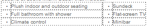
<table cellpadding="0" cellspacing="0" border="0">
<tr>
<td>•</td>
<td>Plush indoor and outdoor seating</td>
<td width="1"></td>
<td>•</td>
<td>Sundeck</td>
</tr>
</table>
Then you need to add a little responsive CSS to make it. Like:
@media only screen and (max-width: 480px), only screen and (max-device-width: 480px) {
	*[class="table2list"] tr {
		display: block !important;
	}
	*[class="table2list"] td {
		display: inline-block !important;
	}
	td[class="table2list"] {
		display: block !important;
	}
}
Then apply class to the table. Like
<table cellpadding="0" cellspacing="0" border="0" class="table2list">
<tr>
<td>•</td>
<td>Plush indoor and outdoor seating</td>
<td width="1" class="table2list"></td>
<td>•</td>
<td>Sundeck</td>
</tr>
</table>
And it's done.
If you have any question or suggestion, please email cyxjimmy@gmail.com